Mango & Co. Café
A warm, confident identity for a neighbourhood café opening its second location.
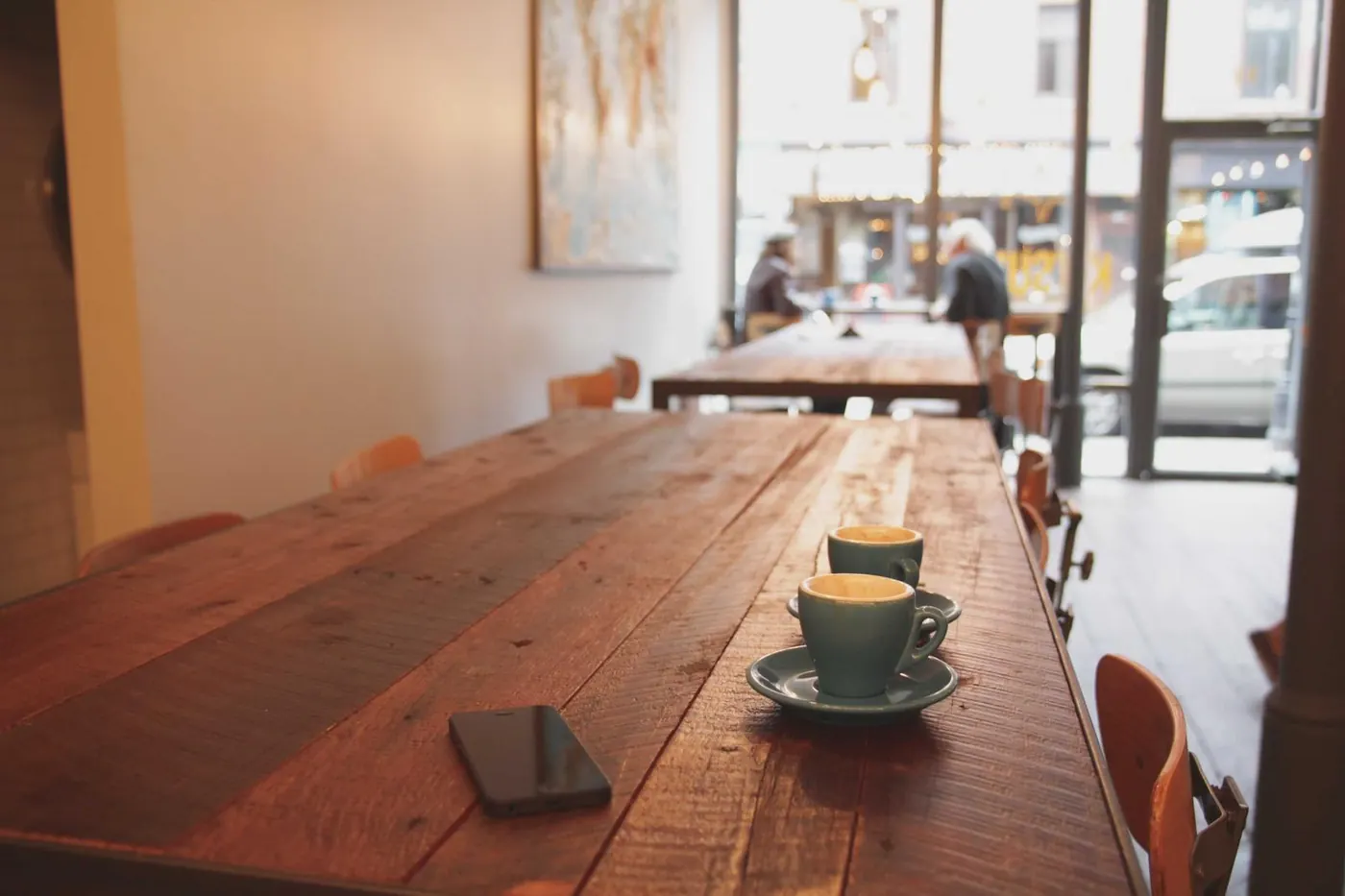
The challenge
Mango & Co. had loyal regulars but a patchwork look: a logo made in a hurry, three different menu styles and cups nobody remembered. With a second café opening across town, the owners needed one identity that felt like the same friendly place at both addresses.
The approach
- Ran a half-day workshop with the owners and two baristas to agree on three words the brand must feel like: generous, unhurried, local.
- Designed a hand-drawn wordmark and a sun-shaped monogram that works on a cup lid as well as a shop front.
- Built a small colour system around ripe mango, roasted cocoa and oat cream, with clear rules for menus, cups and social posts.
- Delivered print-ready files for cups, bags, menu boards, loyalty cards and signage, plus a 12-page brand guide.
The results
38%more loyalty-card sign-ups in the first month
2locations launched on one consistent identity
12 pagesbrand guide the team actually uses
"Customers started photographing our cups. That had never happened before."